Amplifying art outside the museum
de Young Museum
DigitalExperientialInteractiveMarketing CampaignPrint
THE SUMMER OF LOVE EXPERIENCE
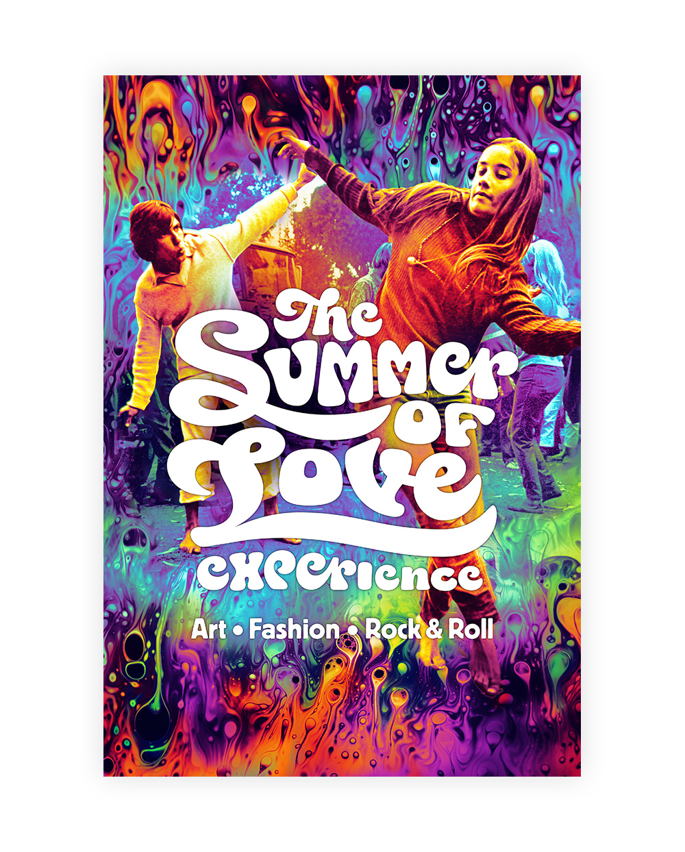
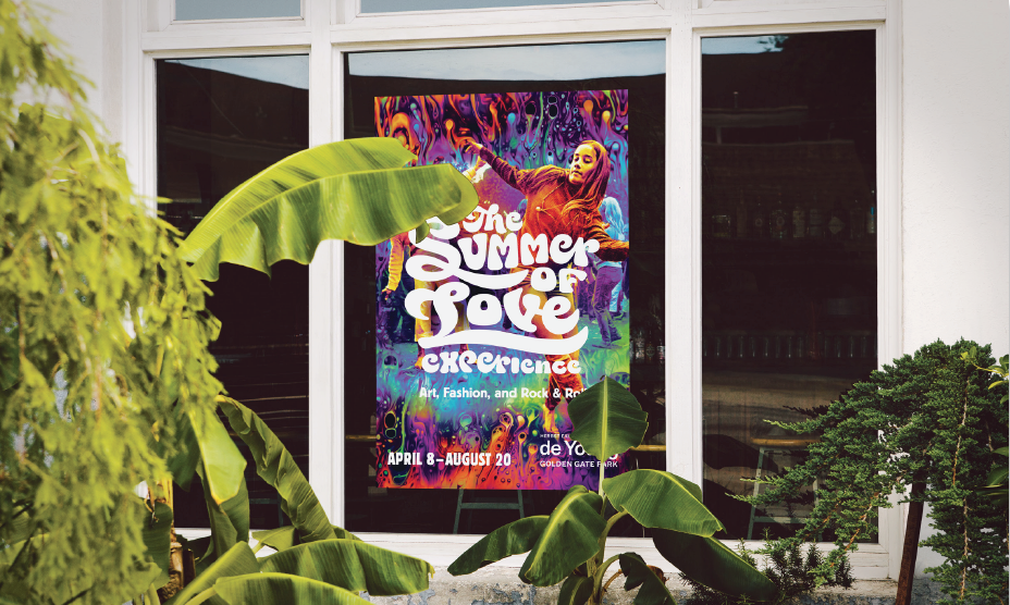
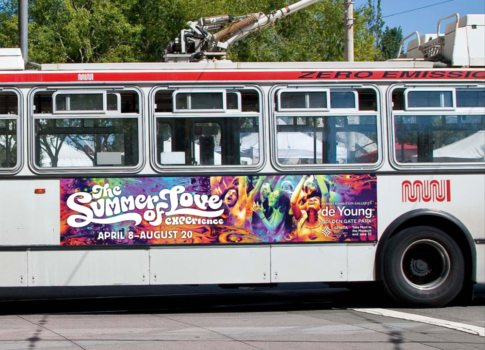
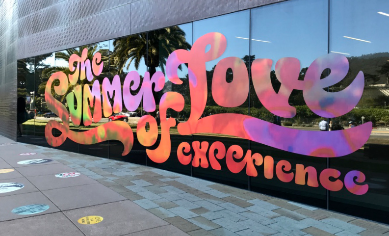
In the summer of 2017, San Francisco celebrated the 50th anniversary of the apex of hippiedom—1967's Summer of Love. Every cultural and historic institution in the city showcased an aspect of that generation-defining moment. The deYoung Museum, located in Golden Gate Park at the edge of the Haight Ashbury neighborhood, sought to transport museum visitors from all over the world to that place and time with a monumental exhibit of psychedelia.
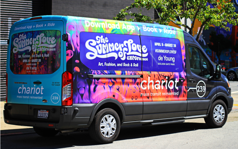
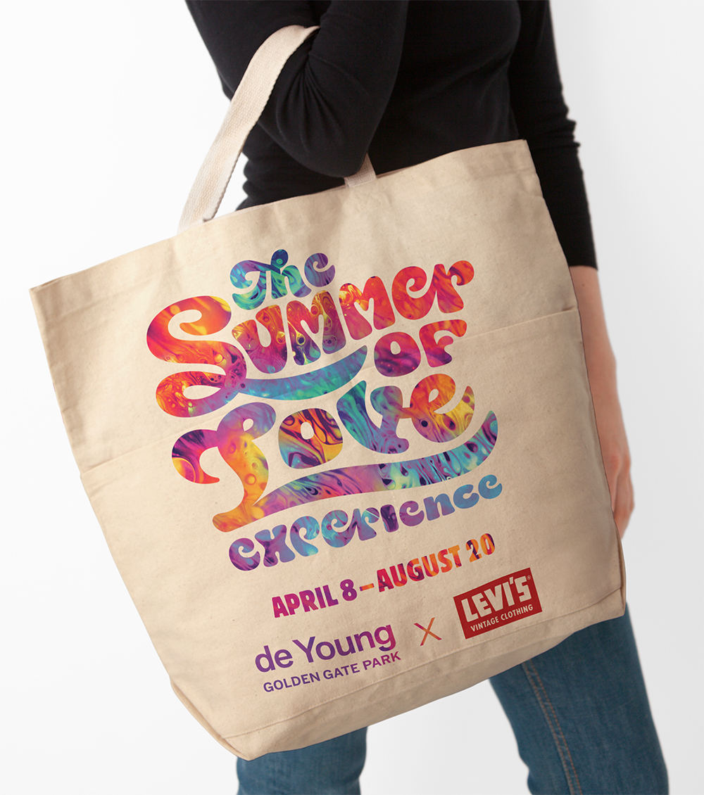
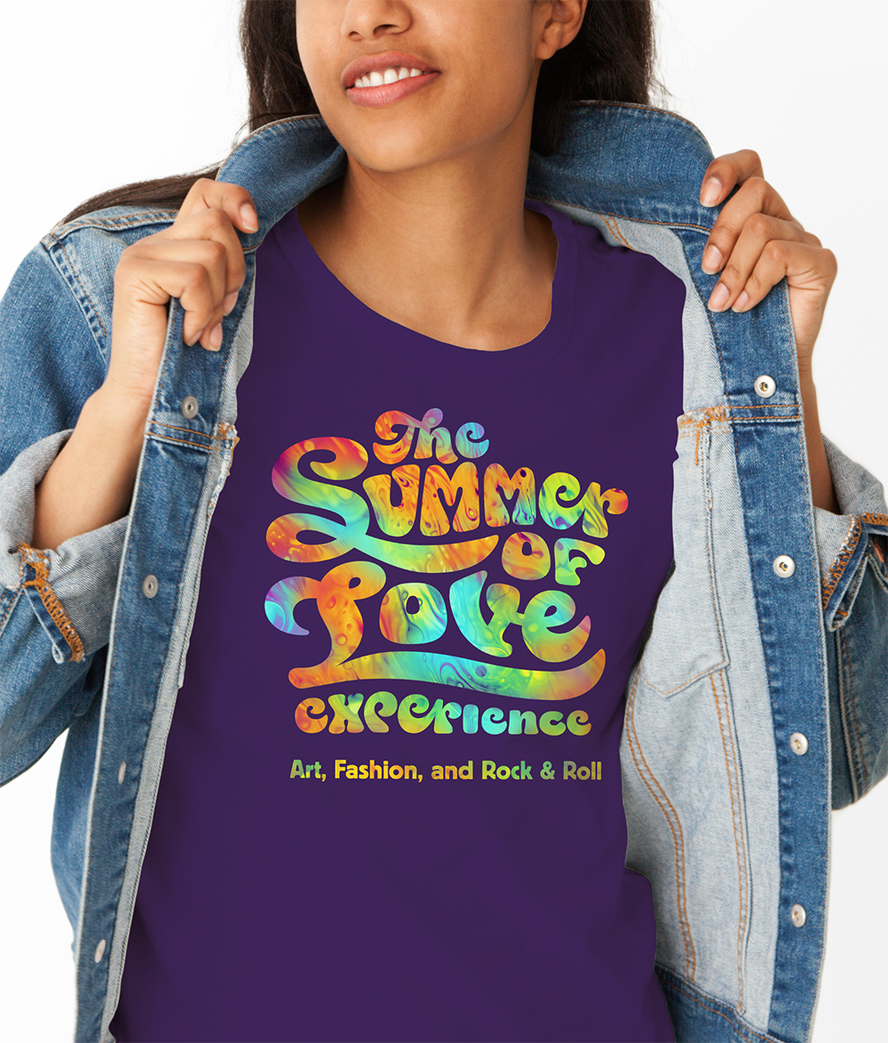
Doublespace was called upon to create an identity that would capture the spirit and essence of the time and instantly convey the breadth and depth of the exhibit. The Summer of Love Experience was successfully deployed on everything from outdoor signage (including bus and cable car posters and street-pole banners) to customized Peet's coffee bags. Attendance exceeded projections by more than 50% and the museum extended the exhibition by additional weeks to accommodate global interest.
OSCAR DE LA RENTA: THE RETROSPECTIVE
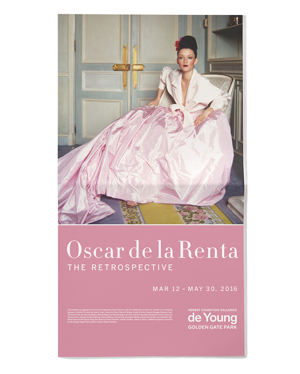
In the spring of 2016, the de Young Museum opened Oscar de la Renta: The Retrospective. This world premiere exhibit celebrates the life and career of one of fashion’s most influential designers. The exhibition included more than 130 pieces produced over five decades and was presented in collaboration with the house of de la Renta and the designer’s family.
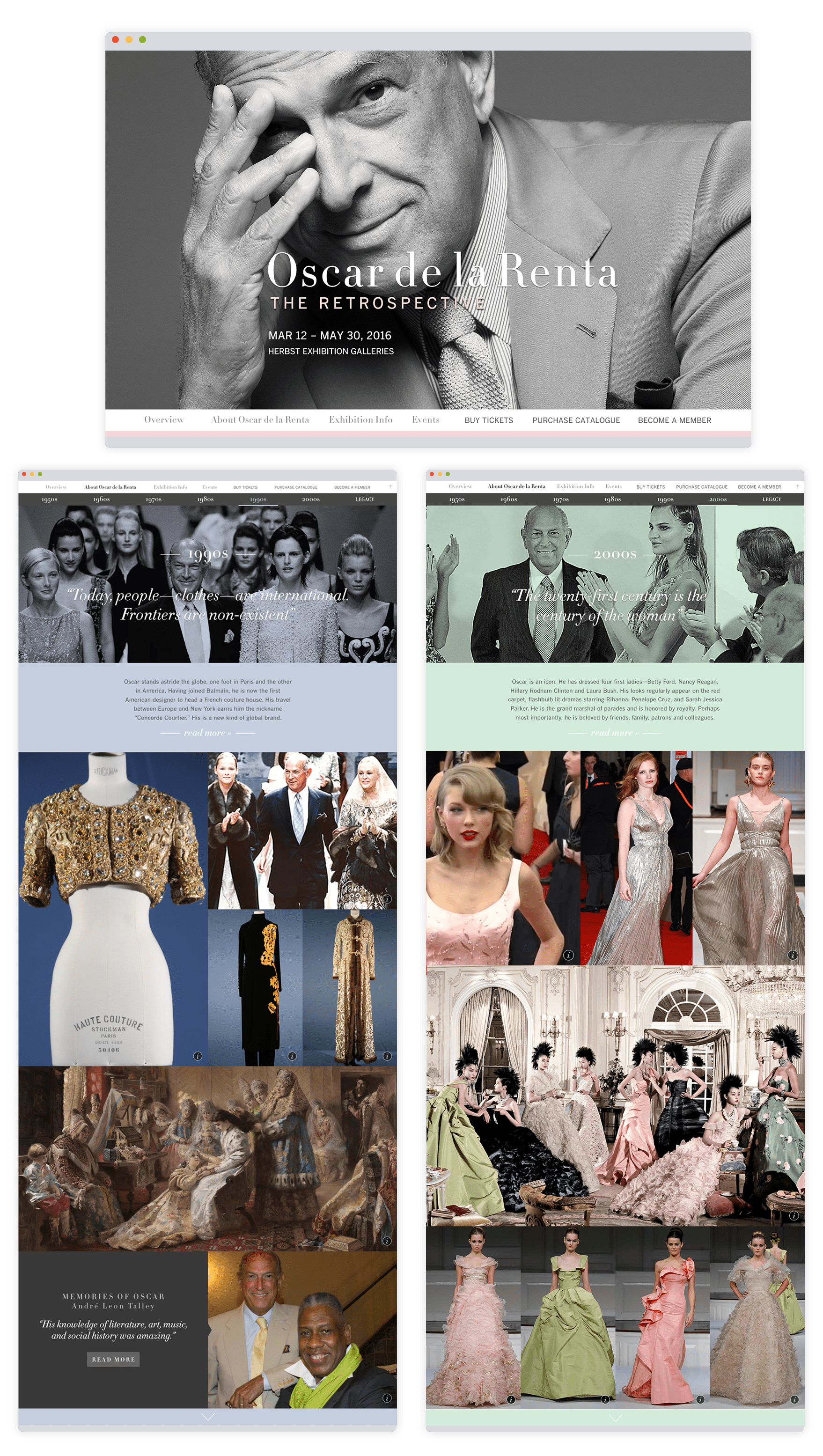
Working with both the museum and family, Doublespace created a robust multimedia campaign that captured the talent of de la Renta and delivered record attendance for the exhibit. Our work included regional print, digital, newspaper, place-based, and out of home media. To supplement the exhibit online, we created a microsite that cleverly took viewers on an exploration of the designer's life decade by decade and combined interviews, moving footage, and testimonials.
Fine Arts Magazine
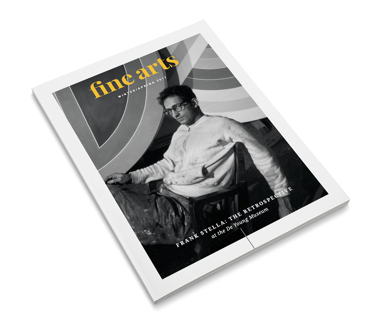
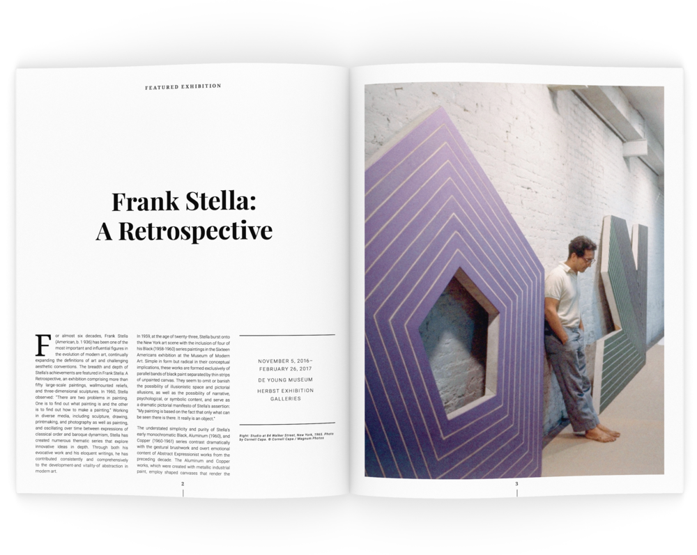
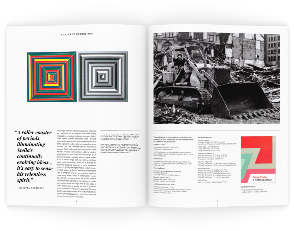
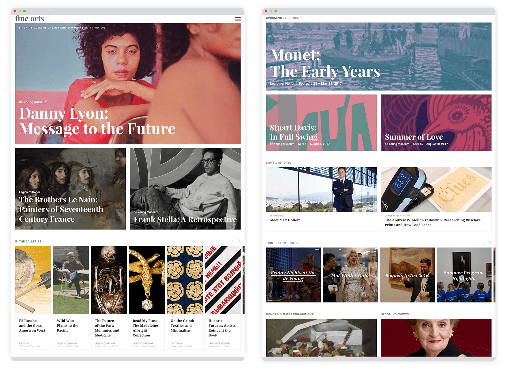
Inspired by the redesigned websites for both the de Young and the Legion of Honor museums, we set forth to reflect their new looks in the Fine Arts Museum of San Francisco's member magazine, Fine Arts.
For the print edition, we increased the format and combined contemporary typefaces, large images, lots of white space, and a clear hierarchy of information to give the publication a more modern look and feel. The online version echoes the redesign of the museum websites and embodies the content of the print publication. Both the print publication and its companion online experience give members a unique view into the happenings at both museums.
